NY Times Strands - maryte - Apr 20, 2024 - 8:55am
Trump - Red_Dragon - Apr 20, 2024 - 8:54am
April 2024 Photo Theme - Happenstance - fractalv - Apr 20, 2024 - 8:40am
NYTimes Connections - geoff_morphini - Apr 20, 2024 - 8:29am
Wordle - daily game - geoff_morphini - Apr 20, 2024 - 8:24am
TV shows you watch - maryte - Apr 20, 2024 - 8:13am
Radio Paradise Comments - GeneP59 - Apr 20, 2024 - 8:00am
Song of the Day - Proclivities - Apr 20, 2024 - 7:38am
Remembering the Good Old Days - kurtster - Apr 20, 2024 - 2:37am
Would you drive this car for dating with ur girl? - kurtster - Apr 19, 2024 - 10:41pm
Vinyl Only Spin List - kurtster - Apr 19, 2024 - 9:21pm
The Abortion Wars - Red_Dragon - Apr 19, 2024 - 9:07pm
The Obituary Page - R_P - Apr 19, 2024 - 8:22pm
Words I didn't know...yrs ago - Bill_J - Apr 19, 2024 - 7:06pm
Things that make you go Hmmmm..... - Bill_J - Apr 19, 2024 - 6:59pm
Baseball, anyone? - Red_Dragon - Apr 19, 2024 - 6:51pm
MILESTONES: Famous People, Dead Today, Born Today, Etc. - Bill_J - Apr 19, 2024 - 6:44pm
2024 Elections! - steeler - Apr 19, 2024 - 5:49pm
What Did You See Today? - Antigone - Apr 19, 2024 - 4:42pm
• • • The Once-a-Day • • • - Isabeau - Apr 19, 2024 - 3:15pm
Ask an Atheist - R_P - Apr 19, 2024 - 3:04pm
Joe Biden - oldviolin - Apr 19, 2024 - 8:55am
Country Up The Bumpkin - KurtfromLaQuinta - Apr 19, 2024 - 7:55am
how do you feel right now? - miamizsun - Apr 19, 2024 - 6:02am
When I need a Laugh I ... - miamizsun - Apr 19, 2024 - 5:43am
Today in History - DaveInSaoMiguel - Apr 19, 2024 - 4:43am
Israel - R_P - Apr 18, 2024 - 8:25pm
Live Music - oldviolin - Apr 18, 2024 - 3:24pm
What Makes You Laugh? - oldviolin - Apr 18, 2024 - 2:49pm
Robots - miamizsun - Apr 18, 2024 - 2:18pm
Museum Of Bad Album Covers - Steve - Apr 18, 2024 - 6:58am
Europe - haresfur - Apr 17, 2024 - 6:47pm
Name My Band - GeneP59 - Apr 17, 2024 - 3:27pm
What's that smell? - Isabeau - Apr 17, 2024 - 2:50pm
USA! USA! USA! - R_P - Apr 17, 2024 - 1:48pm
Business as Usual - black321 - Apr 17, 2024 - 1:48pm
Talk Behind Their Backs Forum - VV - Apr 17, 2024 - 1:26pm
Russia - R_P - Apr 17, 2024 - 1:14pm
Science in the News - Red_Dragon - Apr 17, 2024 - 11:14am
Magic Eye optical Illusions - Proclivities - Apr 17, 2024 - 10:08am
Ukraine - kurtster - Apr 17, 2024 - 10:05am
Photography Forum - Your Own Photos - Alchemist - Apr 17, 2024 - 9:38am
Just for the Haiku of it. . . - oldviolin - Apr 17, 2024 - 9:01am
HALF A WORLD - oldviolin - Apr 17, 2024 - 8:52am
Little known information... maybe even facts - R_P - Apr 16, 2024 - 3:29pm
songs that ROCK! - thisbody - Apr 16, 2024 - 10:56am
260,000 Posts in one thread? - oldviolin - Apr 16, 2024 - 10:10am
WTF??!! - rgio - Apr 16, 2024 - 5:23am
Australia has Disappeared - haresfur - Apr 16, 2024 - 4:58am
Earthquake - miamizsun - Apr 16, 2024 - 4:46am
It's the economy stupid. - miamizsun - Apr 16, 2024 - 4:28am
Republican Party - Isabeau - Apr 15, 2024 - 12:12pm
Eclectic Sound-Drops - thisbody - Apr 14, 2024 - 11:27am
Synchronization - ReggieDXB - Apr 13, 2024 - 11:40pm
Other Medical Stuff - geoff_morphini - Apr 13, 2024 - 7:54am
Photos you have taken of your walks or hikes. - KurtfromLaQuinta - Apr 12, 2024 - 3:50pm
Things You Thought Today - Red_Dragon - Apr 12, 2024 - 3:05pm
Poetry Forum - oldviolin - Apr 12, 2024 - 8:45am
Dear Bill - oldviolin - Apr 12, 2024 - 8:16am
Radio Paradise in Foobar2000 - gvajda - Apr 11, 2024 - 6:53pm
Mixtape Culture Club - ColdMiser - Apr 11, 2024 - 8:29am
New Song Submissions system - MayBaby - Apr 11, 2024 - 6:29am
No TuneIn Stream Lately - kurtster - Apr 10, 2024 - 6:26pm
Caching to Apple watch quit working - email-muri.0z - Apr 10, 2024 - 6:25pm
April 8th Partial Solar Eclipse - Alchemist - Apr 10, 2024 - 10:52am
Bug Reports & Feature Requests - orrinc - Apr 10, 2024 - 10:48am
NPR Listeners: Is There Liberal Bias In Its Reporting? - black321 - Apr 9, 2024 - 2:11pm
Sonos - rnstory - Apr 9, 2024 - 10:43am
RP Windows Desktop Notification Applet - gvajda - Apr 9, 2024 - 9:55am
If not RP, what are you listening to right now? - kurtster - Apr 8, 2024 - 10:34am
And the good news is.... - thisbody - Apr 8, 2024 - 3:57am
How do I get songs into My Favorites - Huey - Apr 7, 2024 - 11:29pm
Pernicious Pious Proclivities Particularized Prodigiously - R_P - Apr 7, 2024 - 5:14pm
Lyrics that strike a chord today... - Isabeau - Apr 7, 2024 - 12:50pm
Dialing 1-800-Manbird - oldviolin - Apr 7, 2024 - 11:18am
Index »
Music »
Whatever »
Museum Of Bad Album Covers
Page: Previous 1 , 2 , 3 , 4 ... 59 , 60 , 61 Next
kurtster
Posted:
Jun 3, 2022 - 10:16am
Steely_D
Posted:
Jun 3, 2022 - 9:31am
kurtster wrote:
I love how it's a
40th anniversary edition of an album I've never heard of.
Skydog
Posted:
Jun 3, 2022 - 7:54am
How about bad covers from popular artists?
rgio
Posted:
Jun 3, 2022 - 6:55am
Proclivities wrote:
If that's the album with "Before she breaks my heart", the content more than makes up for the cover art!
My father played that repeatedly when I was a kid.
Proclivities
Posted:
Jun 3, 2022 - 5:18am
Proclivities
Posted:
Apr 15, 2022 - 10:34am
kurtster
Posted:
Feb 20, 2022 - 2:07am
yuel
Posted:
Feb 9, 2022 - 6:25am
Red_Dragon
Posted:
Dec 21, 2021 - 7:26am
Proclivities wrote:
ScottFromWyoming
Posted:
Dec 21, 2021 - 7:23am
Proclivities
Posted:
Dec 21, 2021 - 4:26am
ScottFromWyoming
Posted:
Nov 19, 2021 - 6:26pm
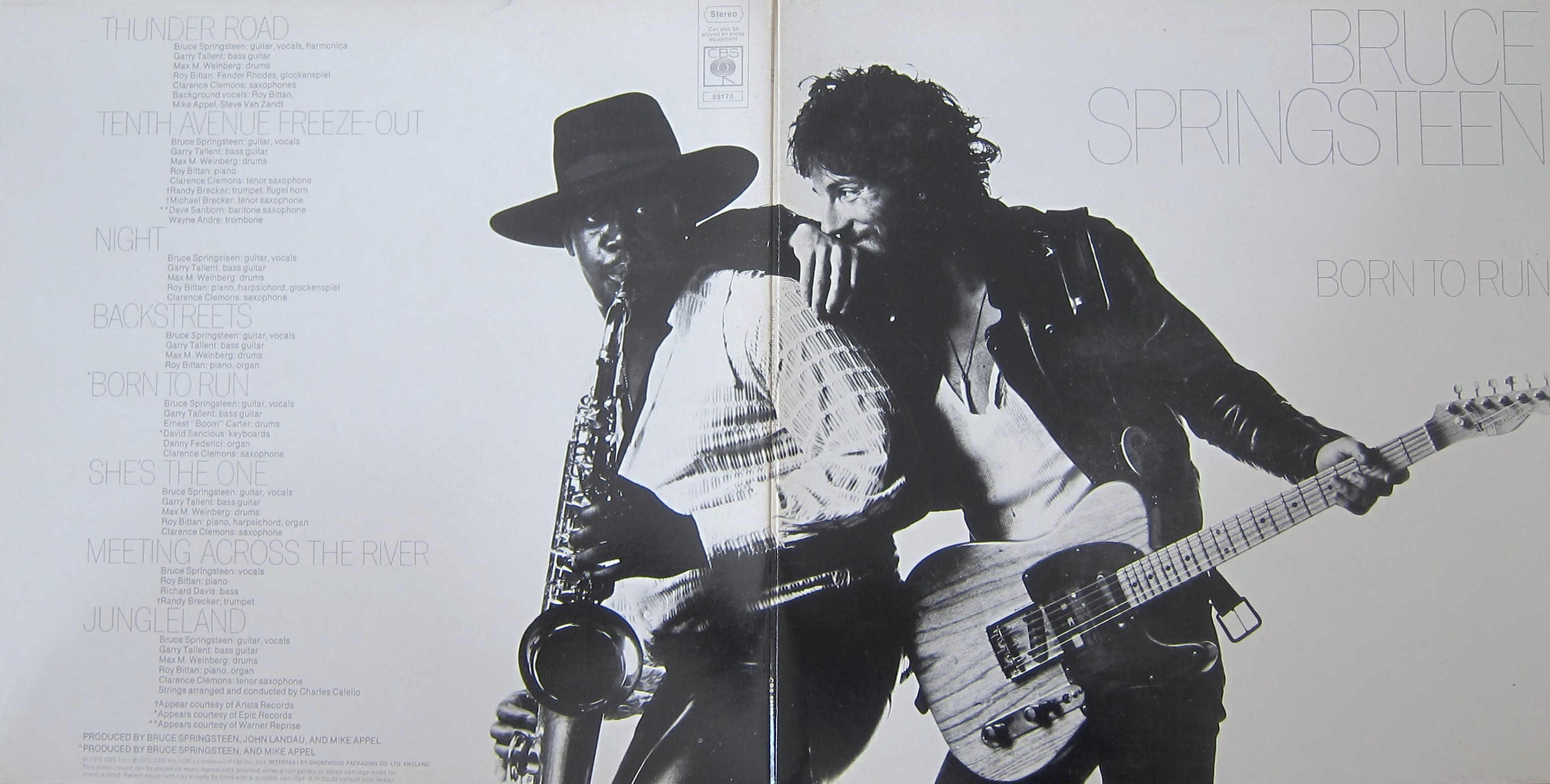
Proclivities wrote: Their first (only?) LP that wasn't just numbered. I always thought they were trying to do something like Springsteen but now that I look at it, maybe just the idea of wrapping the photo around to the back.
Proclivities
Posted:
Nov 19, 2021 - 1:30pm
yuel
Posted:
Oct 27, 2021 - 2:11am
Japanese are crazy....
yuel
Posted:
Sep 21, 2021 - 3:05am
ScottFromWyoming
Posted:
Sep 10, 2021 - 9:39am
Proclivities wrote: 50,000 Hammer Fans Can't Be Wrong.
Proclivities
Posted:
Sep 10, 2021 - 9:11am
yuel
Posted:
Sep 8, 2021 - 12:40am
<a href="
">
ScottFromWyoming
Posted:
Sep 7, 2021 - 7:13am
yuel wrote: Wow! That is not good!
Apparently an influential poet, pushing for Indian rights in Latin America. Still a challenge to listen to.
VIDEO
yuel
Posted:
Sep 7, 2021 - 12:28am


 ">
"> 


 ">
">  ">
">  ">
"> 


 ">
">